









The italicized “Instagram” logo has not been changed since 2016, although the platform itself has changed significantly during that time.
About the new visual identity, Instagram’s head Adam Mosseri announced on his account on the afternoon of August 13. He shared an image of the updated brand and explained that after a decade, it was time to refresh.
“Cleaner and more modern, yet maintaining connections to the original,” wrote A. Mosseri about the updated logo.
The new design quickly received various reactions. As usual, the design community’s evaluations were diverse and often quite critical. Although the updated Instagram logo retained the impression of a handwritten font, its shapes became more modern and restrained. The loops of the letters were reduced but remained connected. Most decorative elements were left in the letters “s,” “r,” and “g,” while the rest of the logo parts became straighter and more rigid in form.
Instagram’s product design director Jasmine Probst shared on social media that in search of a new logo direction, the creative team tried hundreds of different options but ultimately decided to keep its original style.
“The handwritten font conveys the individuality of the social network, so it felt natural to keep that. The new logo is brighter and simpler, but it still contains unexpected details,” she said.
As expected, the updated design received mixed reactions. A. Mosseri’s posts on Instagram and Threads platforms gathered thousands of comments. Some users pointed out the shape of the new letter “r,” which, according to them, resembles the letter “z.” Soon, a joke “Instagzam” began to spread on social networks.
Read more European court organizations express support for TBT, emphasize the importance of independence
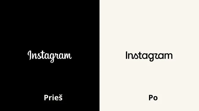
Graphic designers’ evaluations also varied. Some positively appreciated the tidier and clearer cursive logo variant, while others criticized the decision, which they felt ended up somewhere between handwritten and plain font.
The new wordmark logo is already being gradually implemented worldwide, and other updated visual system elements will be introduced in 2026 and beyond. This means that the current change is only part of a broader Instagram brand refresh.
Other innovations introduced
The update was not limited to the logo alone. In the broader Instagram visual identity system, the Instagram Sans font was updated, and two new fonts were introduced – Instagram Pen, resembling handwritten text, and Instagram Mono. Text animations, layout, and user interface were also changed, creating more space. The well-recognized colors remain an important part of the brand but will now be used more subtly.
According to Meta’s brand design director May Harton, the updated system aims to focus more on the creativity and self-expression of the Instagram community. She said the design was created to encourage people to create more boldly, experiment, and express themselves more freely.
One well-recognized Instagram element has so far remained unchanged – the camera symbol. The app icon on the phone screen looks the same as before, although the company has already experimented with alternative versions of it.
Read more At St. Roch Hospital – an incredible conflict, at its epicenter – a drunken department head